Willamette Riverkeeper
branding.
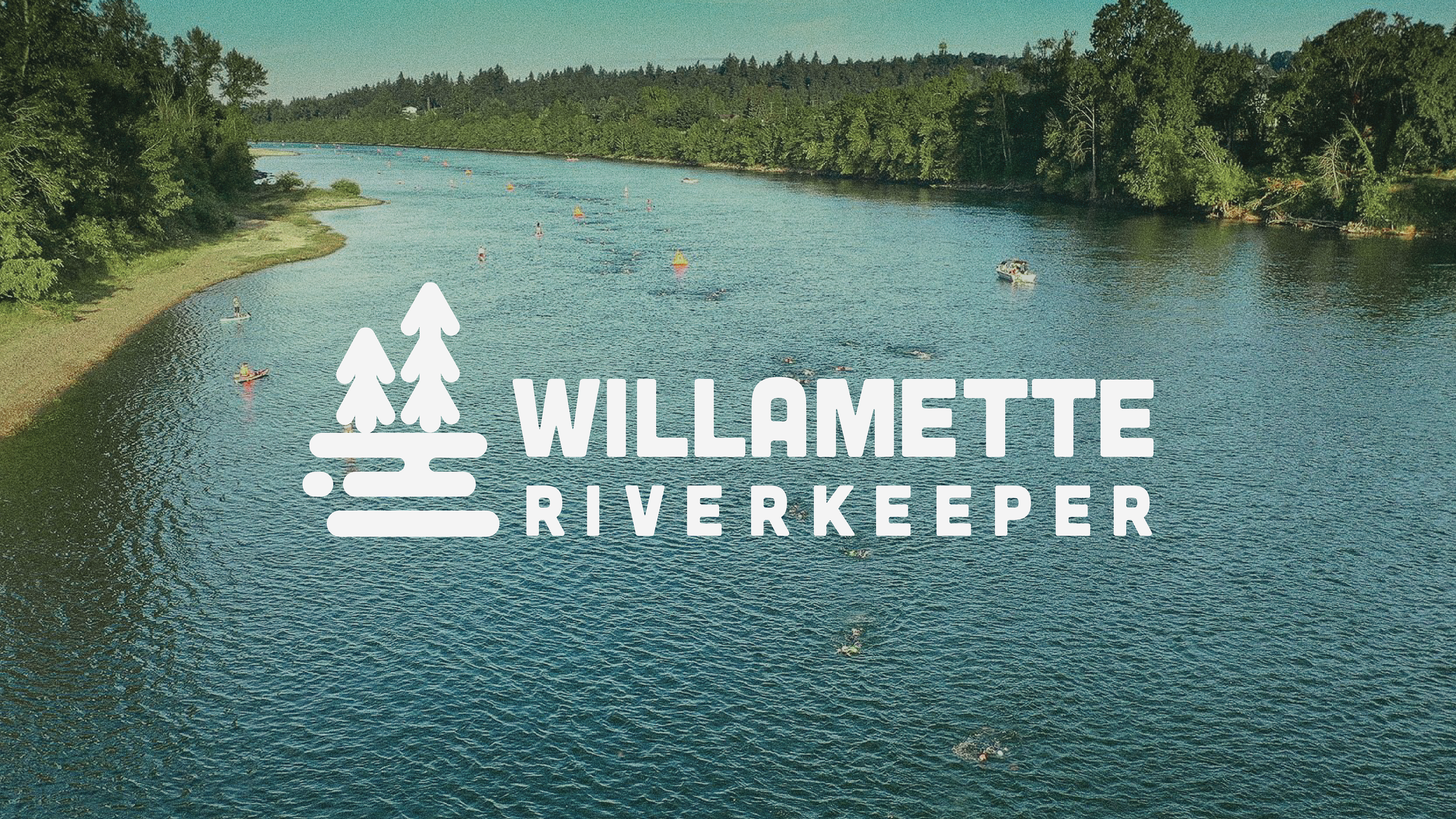
Willamette Riverkeeper came to us looking for a logo redesign. Feeling like their current logo was outdated and old-fashioned, they were looking for a logo that was modern and attracted a demographic much younger than their current one. Their main goal was to inspire younger generations to care about the Willamette River's environmental state.
Taking this information into account, I sought out to create a logo and brand identity that was able to attract younger generations all the while amplifying the environmentalist message of the organization. By using a monochromatic palette of green hues and applied it to a minimalist approach of a river and tree motif, it modernized and revitalized the organization's image drastically.
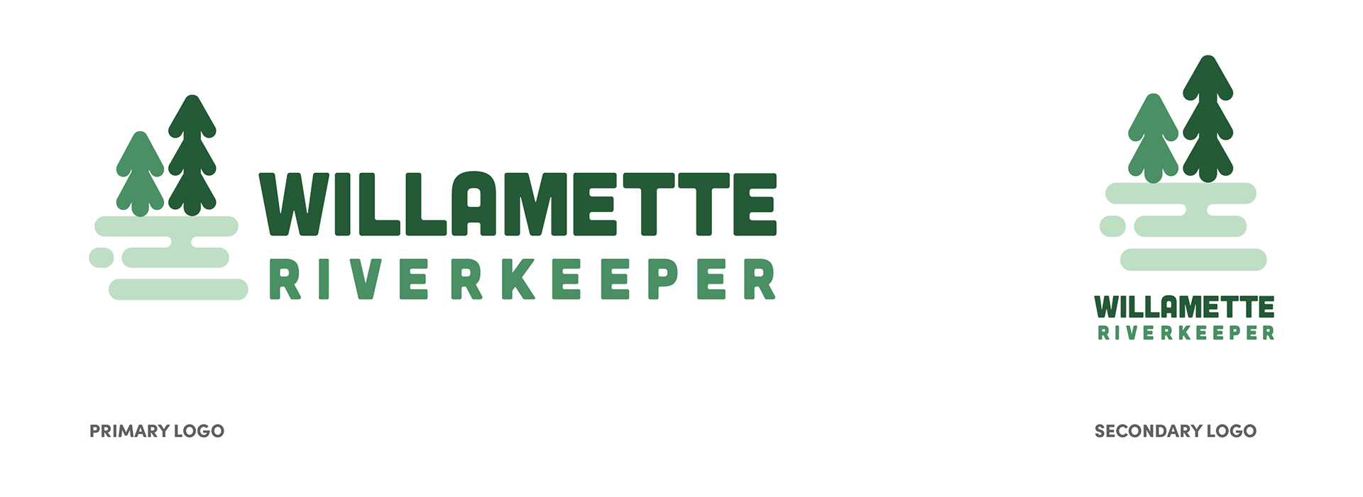
Primary and Secondary Logo
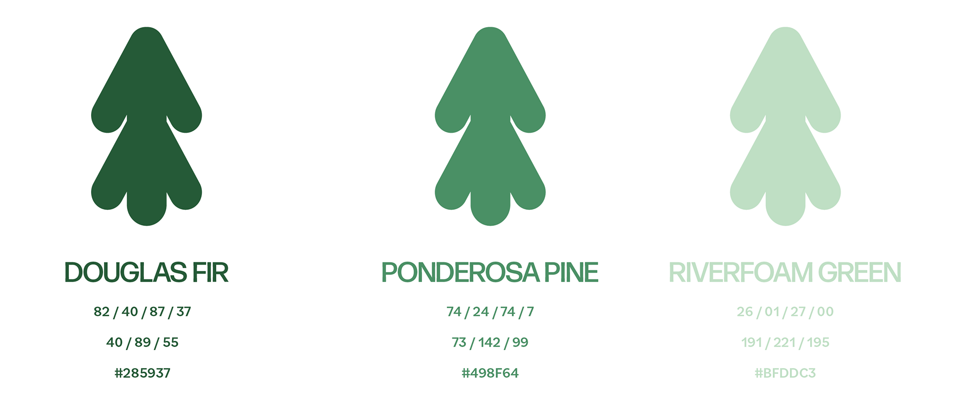
Brand Colors: Douglas Fir, Ponderosa Pine and Riverfoam Green
Merchandise was a very big aspect of this project because it was a main pathway to attracting the goal demographic. The organization wanted to know how and what they should develop in order to target that younger audience as well as using merchandise that made sense to their mission.
Younger adults and teenagers gravitate towards products that are minimalistic and trendy. They also tend to buy brand-heavy apparel and products. Knowing this, I made sure to keep the logo compact and simple.
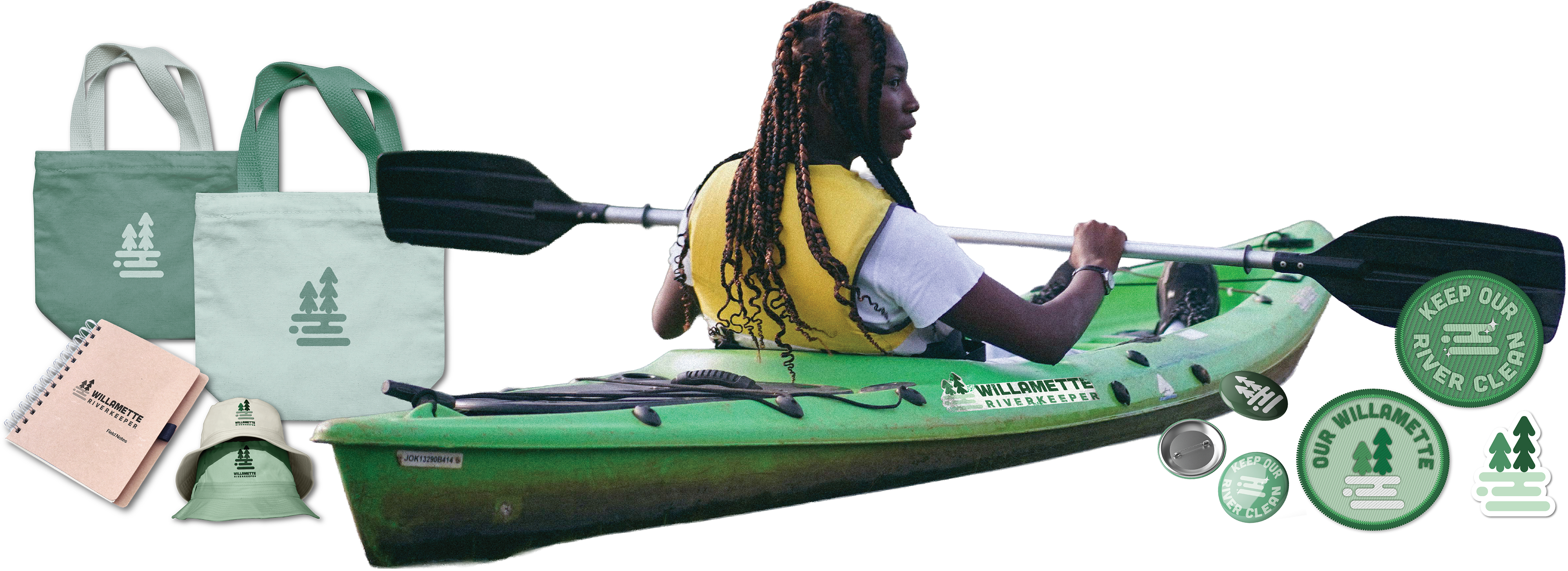
Willamette Riverkeeper Merchandise Mockups: Tote bags, Field Notebook, Branded Bucket Hats, Pins, Patches, Stickers
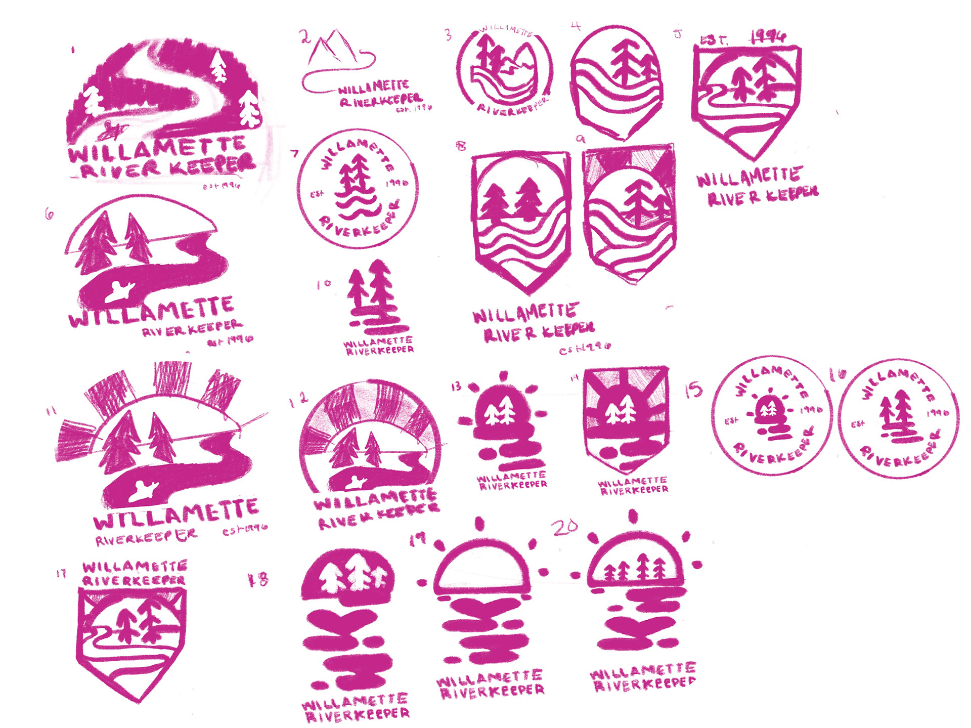
Process Work
sketches + initial iterations
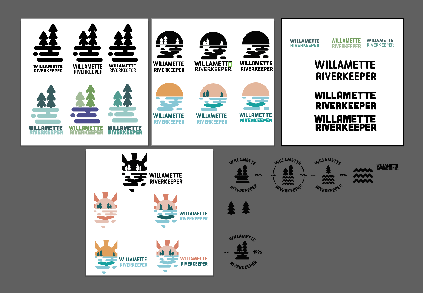
Early Logo Iterations